lydemapr: an R package to map
Lycorma delicatula
Sebastiano De Bona1
Matthew R. Helmus2
03 June 2026
Source:vignettes/introduction.Rmd
introduction.RmdIntroduction
The Spotted lanternfly (Lycorma delicatula, White 1841) is an agricultural pest native of China and Southeast Asia, first discovered in the United states in 2014 in Berks County, PA. Since then, this planthopper has spread throughout the Mid-Atlantic and Midwest regions of the country, threatening the wine and fruit industry and damaging ornamental trees.
Since its first discovery, many sources have collected data on the
presence/absence and population density of this species in order to
monitor its spread and impact. The lydemapr package
contains two anonymized datasets (at 1 km2 and 10
km2 resolution) resulting from an effort to combine,
organize, and aggregate all available sources of data. In addition, this
package contains useful functions to visualize the data within R.
The lydemapr package was built with the intent to
increase accessibility to key data on this species of interest, and to
improve reproducibility and consistency of modeling efforts.
We are constantly looking to expand the data sources to have a full representation of SLF’s presence and abundance in the US. If you wish to contribute to this effort please contact the package authors.
Data Summary
First, let’s see how many observations have been gathered here:
## [1] 1193028Next, let’s take a look at the data structure:
## # A tibble: 6 × 14
##   source  year bio_year latitude longitude state lyde_present lyde_established
##   <chr>  <dbl>    <dbl>    <dbl>     <dbl> <chr> <lgl>        <lgl>
## 1 ny      2023     2023     42.9     -78.9 NY    FALSE        FALSE
## 2 ny      2023     2023     42.9     -78.9 NY    FALSE        FALSE
## 3 ny      2023     2023     42.9     -78.9 NY    FALSE        FALSE
## 4 ny      2023     2023     43.1     -78.3 NY    FALSE        FALSE
## 5 ny      2023     2023     42.9     -78.9 NY    FALSE        FALSE
## 6 ny      2023     2023     42.9     -78.9 NY    FALSE        FALSE
## # ℹ 6 more variables: lyde_density <chr>, source_agency <chr>,
## #   collection_method <chr>, pointID <chr>, rounded_longitude_10k <dbl>,
## #   rounded_latitude_10k <dbl>
Each data point contains information on its source and specific
dataset of origin (“source_agency”). The data is organized by year
(specified as both calendar “year” and “bio_year”, running from May 1st
to April 30th), coordinates, and state. Additional columns define
whether SLF was found during the survey in that location (even as an
anecdotal individual record, “lyde_present”), whether an established
population was found there (“lyde_established”), and what the estimated
population density of SLF was there (“lyde_density”). For additional
information on the variables included, please consult the help file
associated with the data by typing ?lyde in the RStudio
console. A Metadata file can also be found in the compressed folder
lyde_data.zip contained in download_data/.
The package function lyde_summary() breaks the data down
into a quick summary, with data organized by different axes. We can take
a look at the data split across year and States. It’s important to
notice that the data is arranged yearly according to the
biological year of SLF, and not calendar year. This
allows for the appropriate inclusion of egg masses discovered during the
winter months which were laid during the previous calendar year’s
summer/fall.
# data by Year and State
knitr::kable(lyde_summary(year_type = "biological"))| 2014 | 2015 | 2016 | 2017 | 2018 | 2019 | 2020 | 2021 | 2022 | 2023 | 2024 | 2025 | |
|---|---|---|---|---|---|---|---|---|---|---|---|---|
| AZ | 0 | 0 | 0 | 0 | 0 | 10 | 139 | 120 | 204 | 628 | 520 | 0 |
| CT | 0 | 0 | 0 | 0 | 0 | 3 | 2019 | 1435 | 1429 | 1126 | 371 | 148 |
| DC | 0 | 0 | 0 | 0 | 4 | 61 | 9 | 4 | 0 | 8 | 0 | 0 |
| DE | 0 | 0 | 0 | 0 | 1026 | 2181 | 3701 | 5993 | 5072 | 3974 | 5458 | 522 |
| GA | 0 | 0 | 0 | 0 | 0 | 0 | 0 | 0 | 0 | 0 | 10 | 273 |
| ID | 0 | 0 | 0 | 0 | 0 | 0 | 0 | 0 | 1 | 0 | 0 | 0 |
| IL | 0 | 0 | 0 | 0 | 0 | 0 | 2 | 1 | 1 | 13 | 2 | 3 |
| IN | 0 | 0 | 0 | 0 | 79 | 141 | 158 | 502 | 187 | 375 | 463 | 2099 |
| KS | 0 | 0 | 0 | 0 | 0 | 0 | 0 | 23 | 0 | 2 | 0 | 0 |
| KY | 0 | 0 | 0 | 0 | 0 | 3 | 2 | 20 | 180 | 255 | 202 | 340 |
| MA | 0 | 0 | 0 | 0 | 0 | 0 | 886 | 2761 | 2087 | 2321 | 3437 | 4288 |
| MD | 0 | 0 | 0 | 0 | 96 | 2444 | 10321 | 3567 | 922 | 1442 | 1100 | 326 |
| ME | 0 | 0 | 0 | 0 | 0 | 0 | 0 | 20 | 84 | 18 | 28 | 0 |
| MI | 0 | 0 | 0 | 0 | 0 | 0 | 0 | 133 | 360 | 443 | 355 | 404 |
| MO | 0 | 0 | 0 | 0 | 0 | 15 | 118 | 63 | 145 | 111 | 99 | 48 |
| NC | 0 | 0 | 0 | 0 | 0 | 14085 | 5 | 109 | 4788 | 2052 | 3639 | 3790 |
| NH | 0 | 0 | 0 | 0 | 0 | 0 | 0 | 0 | 59 | 12 | 3 | 4 |
| NJ | 0 | 0 | 0 | 0 | 2493 | 9467 | 8871 | 88337 | 40269 | 939 | 511 | 2737 |
| NM | 0 | 0 | 0 | 0 | 0 | 0 | 10 | 28 | 26 | 17 | 17 | 0 |
| NY | 0 | 0 | 0 | 0 | 18482 | 27172 | 18010 | 12285 | 17935 | 15020 | 4014 | 4277 |
| OH | 0 | 0 | 0 | 0 | 0 | 0 | 635 | 630 | 1169 | 1164 | 316 | 12573 |
| OR | 0 | 0 | 0 | 0 | 0 | 0 | 92 | 15 | 454 | 60 | 349 | 5 |
| PA | 410 | 46445 | 28659 | 15258 | 86788 | 162409 | 97834 | 73379 | 86087 | 79408 | 52255 | 26804 |
| RI | 0 | 0 | 0 | 0 | 0 | 0 | 45 | 18 | 285 | 538 | 1610 | 2602 |
| SC | 0 | 0 | 0 | 0 | 0 | 2 | 5 | 49 | 70 | 41 | 39 | 610 |
| TN | 0 | 0 | 0 | 0 | 0 | 0 | 0 | 0 | 0 | 1161 | 1266 | 1895 |
| TX | 0 | 0 | 0 | 0 | 0 | 0 | 0 | 0 | 149 | 284 | 0 | 0 |
| VA | 0 | 0 | 0 | 2 | 1497 | 3980 | 2749 | 2442 | 2619 | 3545 | 1622 | 1118 |
| VT | 0 | 0 | 0 | 0 | 0 | 0 | 0 | 0 | 24 | 0 | 2 | 120 |
| WA | 0 | 0 | 0 | 0 | 0 | 0 | 0 | 0 | 10 | 9 | 0 | 1929 |
| WI | 0 | 0 | 0 | 0 | 0 | 0 | 1 | 0 | 30 | 46 | 82 | 153 |
| WV | 0 | 0 | 0 | 0 | 3 | 998 | 1496 | 1879 | 1428 | 859 | 806 | 305 |
Maps of the Spread of SLF
Two functions allow the user to plot the data:
map_spread() and map_yearly.
The first function produces a snapshot of the SLF spread in the United States, with reference to the sampling effort associated with surveying the spread. Surveys finding an established population are plotted on the map as filled tiles, color coded by the year of first discovery. Surveys finding no established population are plotted as grey tiles.
As the plotting of the data might take a long time to display within R, we encourage the user to assign the map and save it as a pdf instead, like we show below.
# assigning the map
map_1 <- map_spread()
The map can be saved as a pdf file at high resolution.
# If executing this line while running the vignette manually,
# be advised that it might take a considerable amount of time
# for the map to be displayed.
# It's advised to visualize the pdf file saved above.
map_1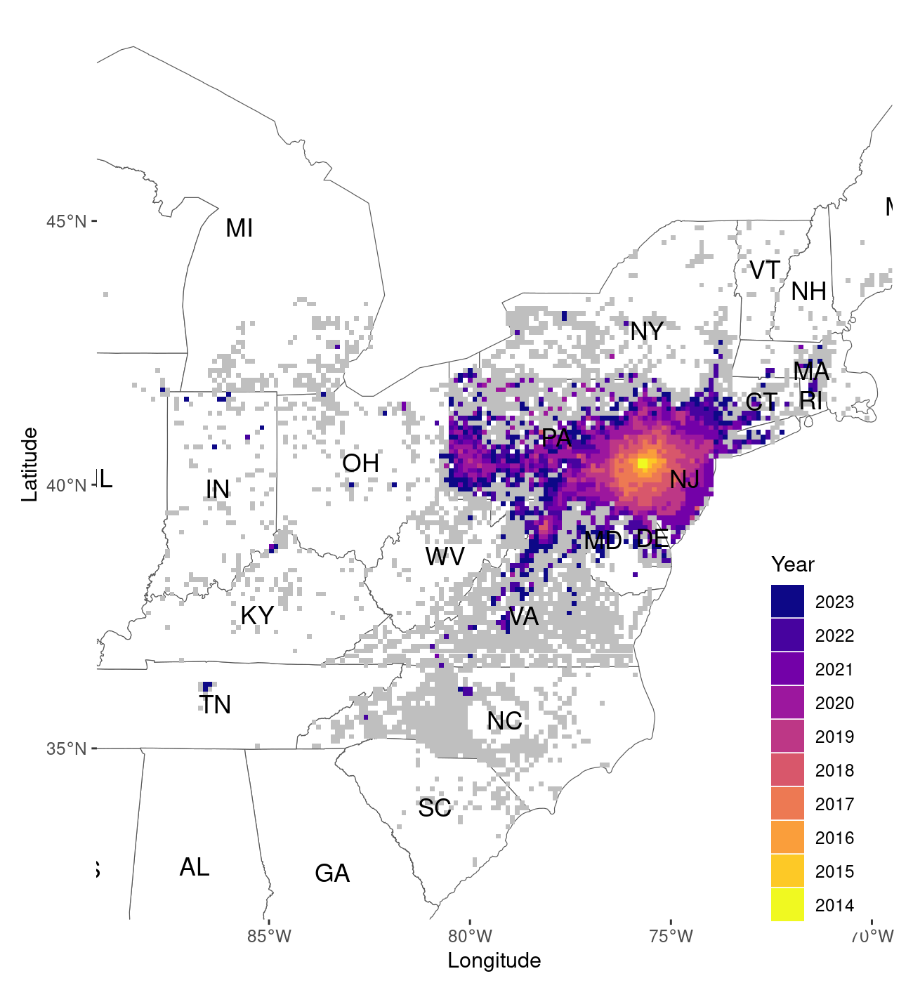
Output of the map_spread() function, plotted at the 10km
resolution
The default function displays data aggregated at the 10km2
(Figure 1). The function can be customized to show the data at higher
spatial resolution (1k2), by setting the function option
resolution to “1k”. This will take considerably longer, so
saving the result as a pdf is preferable in this instance as well.
map_2 <- map_spread(resolution = "1k")
# If executing this line while running the vignette manually,
# be advised that it might take a considerable amount of time
# for the map to be displayed.
# It's advised to visualize the pdf file saved above.
map_2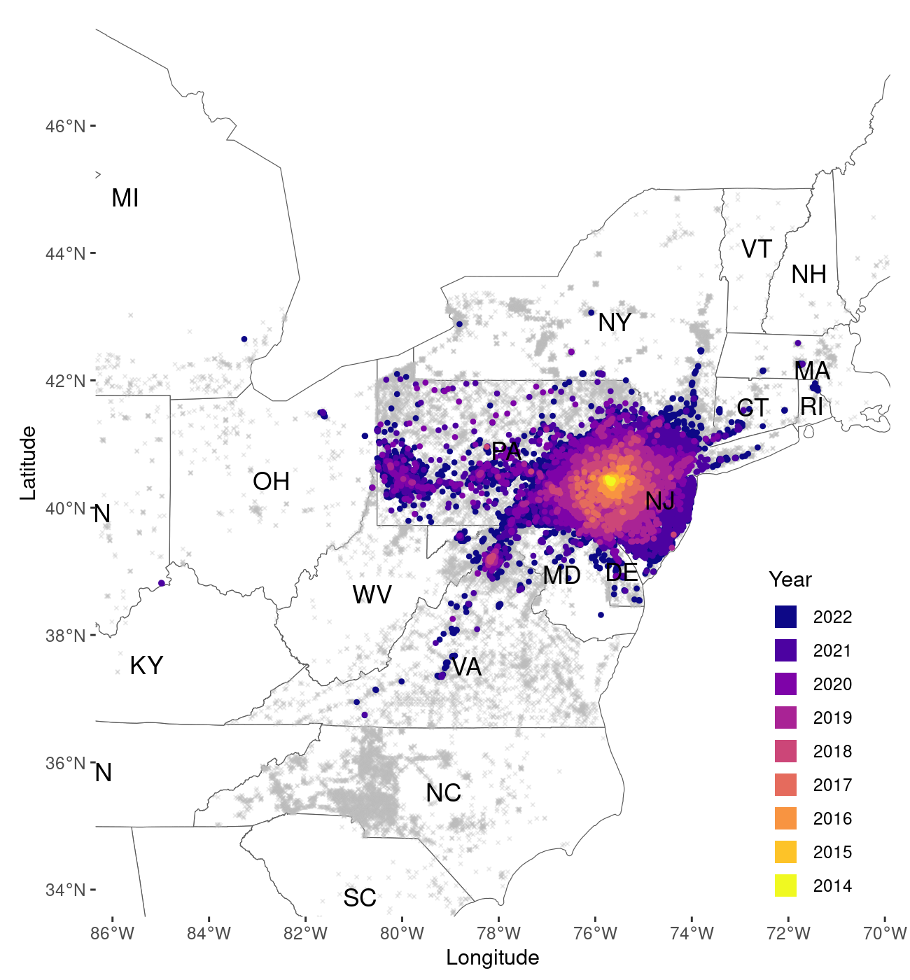
Output of the map_spread() function now plotted at a finer
1km resolution
The function displays data in a slightly different fashion at the 1km2 resolution (Figure 2). At 10km2 the data is plotted at filled tiles. This improves the visualization by representing the grid in which the data is organized more clearly. As tiles of size 1km are much smaller, we prefer to display survey points at this resolution as points on the map.
If the user wishes to visualize the data for a smaller area of the
United States, the function allows them to specify which area should be
mapped, by setting the zoom variable to “custom” and
specifying the boundaries of the mapped area through
xlim_coord (longitude) and ylim_coord
(latitude), as Laongitude and Latitude coordinates using the WG84
projection. Here’s an example of how this can be achieved.
# assigning object
map_3 <- map_spread(resolution = "1k",
           zoom = "custom",
           xlim_coord = c(-78, -74),
           ylim_coord = c(38, 42))
# If executing this line while running the vignette manually,
# be advised that it might take a considerable amount of time
# for the map to be displayed.
# It's advised to visualize the pdf file saved above.
map_3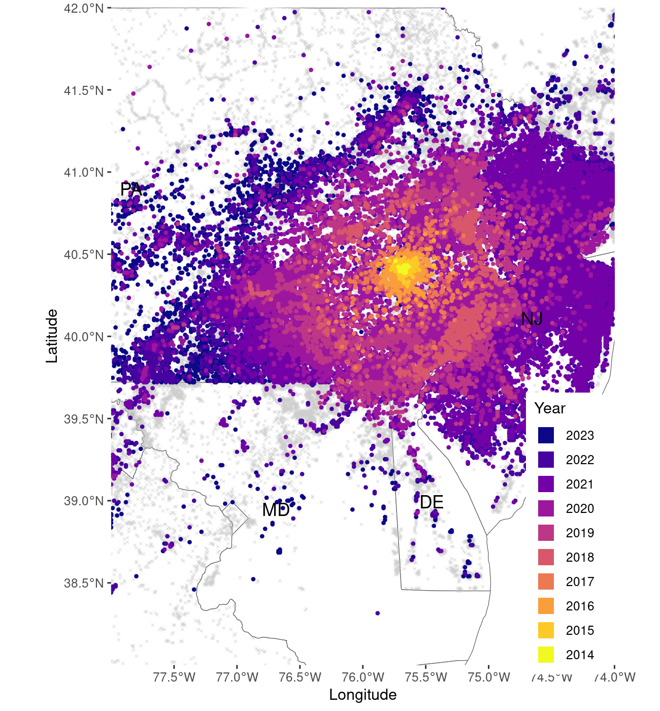
Zoomed area, focusing on the core of the invasion range
The second function, map_yearly() allows the user to
visualize the progression of SLF establishment, with a focus on the
estimated population density through time. Note that the data here is
not cumulative, meaning only data from a given year is shown in any
given panel of the figure.
# running year-specific map
# assigning object
map_4 <- map_yearly(ncol = 3)
# If executing this line while running the vignette manually,
# be advised that it might take a considerable amount of time
# for the map to be displayed.
# It's advised to visualize the pdf file saved above.
# map_4
Temple University, sebastiano.debona@gmail.com↩︎
Temple University, mrhelmus@temple.edu↩︎