Invasion Potential Alignment
vignette-021-quadrant-plots.RmdBuild and Save Risk Correlation Quadrant Plots (Ensemble Extracts)
This vignette visualizes the Introduction, Establishment, and
Impact potentials in a plot together for U.S. states or
countries. There are a few set-up and modifications steps that can be
modified in the .Rmd itself before rendering the
vignette.
Setup
To produce the published correlation figures, we must first conduct a few setup steps. First, we read in the appropriate data and packages.
library(slfrsk)
library(tidyverse)
library(here)
library(ggrepel)
library(grid)
library(gridExtra) #only needed if one uses grid.arrange() in plotting
library(plotly) #interactive corplot
library(scales) #make custom tranform object for plotly corplots
Toggle data partitions
Secondarily, we confirm the particular partitions of data we intend to visualize (defaults match the published figures). Here is where one could change the version of data for the correlation figure via the following:
- one_zero: Scale Transportation potential to be
bounded \([0,1]\)?
- default is
TRUE
- default is
- present_transport: Use
presentorfutureinfected U.S. states?- default is
TRUEforpresent
- default is
- method_cor: Which type of multiple correlation to calculate?
- default is
"spearman"(but seecor.test()documentation for more information)
- default is
- impact_prod: Which Impact potential product to
evaluate?
- default is
"grapes"but can also look at"wine"
- default is
- native: Plot the
countriesthat have native Lycorma in thecountriesplot?- default is
TRUE
- default is
- rem_usa: Remove the “United States” from the
countriesplot?- default is
TRUE
- default is
# Make transport scaled between one and zero
one_zero <- TRUE

# switch between present or future transport
present_transport <- TRUE

# Set what type of multiple correlation to calculate
method_cor <- "spearman"

# set whether to look at grape or wine production (PLOT LABELS ARE NOT CLEAN FOR WINE!!!)
#impact_prod <- "wine"
impact_prod <- "grapes"

# Plot the native countries?
native <- TRUE

# remove USA?
rem_usa <- TRUE

# NONFUNCTIONAL---Replace this with max mean quantile_0.50 quantile_0.75 quantile_0.90 to edit which metric to plot for establishment
#to run this, one needs to use different extract data sources further back in the cleaning process (vig01) by selecting a different variable
#estab_to_plot <- "max" # max was used for the quadrant figures
Read in data
We now load the summary data from
vignette-010-tidy-data. Both states and
countries data are loaded.
  #data("states_summary_present")
  #data("countries_summary_present")
  #data("states_summary_future")
  #data("countries_summary_future")
    data("states_summary_present_ensemble")
    data("countries_summary_present_ensemble")
    data("states_summary_future_ensemble")
    data("countries_summary_future_ensemble")

  states_summary_present <-  states_summary_present_ensemble
  countries_summary_present <- countries_summary_present_ensemble
  states_summary_future <-  states_summary_future_ensemble
  countries_summary_future <- countries_summary_future_ensemble

  #filter out some No Data for ensemble model
  countries_summary_future <- countries_summary_future %>%
    filter(!ID %in% c("Antarctica", "Monaco", "Norfolk Island", "Spratly Islands"))
  countries_summary_present <- countries_summary_present %>%
filter(!ID %in% c("Antarctica", "Monaco", "Norfolk Island", "Spratly Islands"))NATIVE—If Lycorma-native countries can be
coded as native or not established (not
“invaded”) for plotting purposes with the native setting
above.
if(native){
  countries_summary_present$status[countries_summary_present$geopol_unit %in% c("China", "India", "Taiwan", "Vietnam")] <- "native"
  countries_summary_future$status[countries_summary_future$geopol_unit %in% c("China", "India", "Taiwan", "Vietnam")] <- "native"
} else {
  countries_summary_present$status[countries_summary_present$geopol_unit %in% c("China", "India", "Taiwan", "Vietnam")] <- "not established"
  countries_summary_future$status[countries_summary_future$geopol_unit %in% c("China", "India", "Taiwan", "Vietnam")] <- "not established"
  }
states SCALING—Even though a column in
the states data does include the \(log_{10}(value+1)\) transformation of
transport potential, the mass of trade with infected
states (log10_avg_infected_mass), the raw data were \(log_{10}(value+1)\) transformed and then
further rescaled (see one_zero above) as
avg_infected_mass_scaled. The
establishment potential is already scaled the same
[0,1], but we create a new column of its values with the same
_scaled suffix.
If one_zero <- FALSE, then transport
potential is just \(log_{10}(value+1)\)
transformed instead.
Please note that states and countries
rescaling are done separately, as the latter has several rows that lack
trade data (e.g., NA).
# scale the import data

if(one_zero){
  states_summary_present <- states_summary_present %>%
    # transport
    mutate(avg_infected_mass_scaled = log10(avg_infected_mass+1)) %>%
    mutate(avg_infected_mass_scaled = (avg_infected_mass_scaled - min(avg_infected_mass_scaled))) %>%
    mutate(avg_infected_mass_scaled = avg_infected_mass_scaled / max(avg_infected_mass_scaled)) %>%
    # establishment
    mutate(grand_mean_max_scaled = grand_mean_max)
  # mutate(grand_mean_max_scaled = (grand_mean_max - min(grand_mean_max))) %>%
  # mutate(grand_mean_max_scaled = grand_mean_max_scaled / max(grand_mean_max_scaled))
  states_summary_future <- states_summary_future %>%
    # transport
    mutate(avg_infected_mass_scaled = log10(avg_infected_mass+1)) %>%
    mutate(avg_infected_mass_scaled = (avg_infected_mass_scaled - min(avg_infected_mass_scaled))) %>%
    mutate(avg_infected_mass_scaled = avg_infected_mass_scaled / max(avg_infected_mass_scaled)) %>%
    # establishment
    mutate(grand_mean_max_scaled = grand_mean_max)
} else {
  states_summary_present <- states_summary_present %>%
    # transport
    mutate(avg_infected_mass_scaled = log(avg_infected_mass+1)) # %>%
    # establishment
  states_summary_future <- states_summary_future %>%
    # transport
    mutate(avg_infected_mass_scaled = log(avg_infected_mass+1))
}
countries REMOVAL—For the
countries analysis, several countries in the actual dataset
are not informative (usually due to lack of trade with the infected
states or NA reported). If rem_usa <- TRUE,
then the U.S. is also removed from the countries analyses.
This is an important step, as the cou
if(rem_usa){ # TRUE if you want to remove the USA
  rems <- c("Akrotiri and Dhekelia"
            ,"?land"
            ,"American Samoa"
            ,"Bouvet Island"
            ,"British Indian Ocean Territory"
            ,"Caspian Sea"
            ,"Christmas Island"
            ,"Clipperton Island"
            ,"Cocos Islands"
            ,"Falkland Islands"
            ,"Faroe Islands"
            ,"French Southern Territories"
            ,"Heard Island and McDonald Islands"
            ,"Mayotte"
            ,"Northern Mariana Islands"
            ,"Paracel Islands"
            ,"Pitcairn Islands"
            ,"Saint Pierre and Miquelon"
            ,"Tokelau"
            ,"United States Minor Outlying Islands"
            ,"Wallis and Futuna"
            ,"United States"
            ,"Philippines")
} else {
  rems <- c("Akrotiri and Dhekelia"
            ,"?land"
            ,"American Samoa"
            ,"Bouvet Island"
            ,"British Indian Ocean Territory"
            ,"Caspian Sea"
            ,"Christmas Island"
            ,"Clipperton Island"
            ,"Cocos Islands"
            ,"Falkland Islands"
            ,"Faroe Islands"
            ,"French Southern Territories"
            ,"Heard Island and McDonald Islands"
            ,"Mayotte"
            ,"Northern Mariana Islands"
            ,"Paracel Islands"
            ,"Pitcairn Islands"
            ,"Saint Pierre and Miquelon"
            ,"Tokelau"
            ,"United States Minor Outlying Islands"
            ,"Wallis and Futuna"
            ,"Philippines")

}

#do the rm now
countries_summary_present <- countries_summary_present %>% filter(!ID %in% rems)
countries_summary_future <- countries_summary_future %>% filter(!ID %in% rems)
countries SCALING—Now that
countries contains only rows of interest, we rescaled the
transport potential as above for states
and created the same _scaled data columns.
Now rescale countries as states
# scale the import data

if(one_zero){

  countries_summary_present <- countries_summary_present %>%
    # transport
    mutate(avg_infected_mass_scaled = log10(avg_infected_mass+1)) %>%
    mutate(avg_infected_mass_scaled = (avg_infected_mass_scaled - min(avg_infected_mass_scaled))) %>%
    mutate(avg_infected_mass_scaled = avg_infected_mass_scaled / max(avg_infected_mass_scaled)) %>%
    # establishment
    mutate(grand_mean_max_scaled = grand_mean_max)
  # mutate(grand_mean_max_scaled = (grand_mean_max - min(grand_mean_max))) %>%
  # mutate(grand_mean_max_scaled = grand_mean_max_scaled / max(grand_mean_max_scaled))

  countries_summary_future <- countries_summary_future %>%
    # transport
    mutate(avg_infected_mass_scaled = log10(avg_infected_mass+1)) %>%
    mutate(avg_infected_mass_scaled = (avg_infected_mass_scaled - min(avg_infected_mass_scaled))) %>%
    mutate(avg_infected_mass_scaled = avg_infected_mass_scaled / max(avg_infected_mass_scaled)) %>%
    # establishment
    mutate(grand_mean_max_scaled = grand_mean_max)

} else {

  countries_summary_present <- countries_summary_present %>%
    # transport
    mutate(avg_infected_mass_scaled = log(avg_infected_mass+1)) %>%
    # establishment
    mutate(grand_mean_max_scaled = grand_mean_max)

  countries_summary_future <- countries_summary_future %>%
    # transport
    mutate(avg_infected_mass_scaled = log(avg_infected_mass+1)) %>%
    # establishment
    mutate(grand_mean_max_scaled = grand_mean_max)

}
Additional Note: Below is code that can be used to
make a version of the country data that removes all
countries that have a no trade with infected states (we
leave the zeroes in for the current figures):
if(FALSE){
#rm the trade mass zero countries
countries_summary_nozeros_present <- countries_summary_present %>% filter(log10_avg_infected_mass != 0)
countries_summary_nozeros_future <- countries_summary_future %>% filter(log10_avg_infected_mass != 0)

#rescale and log transform countries with the zeros for trade mass rm
countries_summary_nozeros_present <- countries_summary_nozeros_present %>%
  mutate(avg_infected_mass_scaled = log(avg_infected_mass+1)) %>%
  mutate(avg_infected_mass_scaled = (avg_infected_mass_scaled-min(avg_infected_mass_scaled))) %>%
  mutate(avg_infected_mass_scaled = avg_infected_mass_scaled/max(avg_infected_mass_scaled))
countries_summary_nozeros_future <- countries_summary_nozeros_future %>%
  mutate(avg_infected_mass_scaled = log(avg_infected_mass+1)) %>%
  mutate(avg_infected_mass_scaled = (avg_infected_mass_scaled-min(avg_infected_mass_scaled))) %>%
  mutate(avg_infected_mass_scaled = avg_infected_mass_scaled/max(avg_infected_mass_scaled))
}
Plotting
Now that the data have been prepared accordingly, plotting of the relationship among all three potentials can be visualized. For ease of viewing, we begin by setting a few plotting parameters before visualization.
Plotting parameters
The following plotting parameters are set to produce the published figures but could be changed for plot customization:
- label.countries.est: Label the countries that Lycorma has
previously become established (Japan and South Korea) in the
countriesplot?- default is
TRUE
- default is
- label.states.est: Label the U.S. states that Lycorma has
previously become established according to
presentorfuturescenarios in thestatesplot?- default is
TRUE - adds CT, DE, MD, NJ, OH, WV (all others already labeled)
- default is
- all nudge_* objects: custom settings for
geom_text_repelstarting positions of labels for the added countries or states. Within the major plotting chunk, one can change the nudging of the main plotted labels.
# label both of the countries (or states) with established SLF?
label.countries.est <- TRUE
label.states.est <- TRUE   #same for both present/future: CT, DE, MD, NJ, OH, WV
# labeling aesthetics for label.countries.est and label.states.est
nudge_countries.est.x <- c(.05,0.05)
nudge_countries.est.y <- c(.12,0.11)
nudge_countries.est_future.x <- c(.05,0.05)  #jpn and kor
nudge_countries.est_future.y <- c(.12,0.11)
nudge_states.est.x <- c( 0.00, 0.00, -0.10,  0.02, 0.01, 0.00)  #adding OH, CT, DE, MD, NJ, WV
nudge_states.est.y <- c(-0.10, -0.10, 0.10, -0.17,-0.15,-0.10)


# Choose quadrant intercepts
q_intercepts <- list(transport = 0.5, establishment = 0.5)
#set margins
hh = .001
# Do not change this flips between plotting the states or plotting countries
plots_which <- c(TRUE,FALSE)
# How many countries and states to highlight for labels?
top_to_plot <- 10
#color aesthetics
risk_color <- "gray40"
risk_size <- 5


#lx <- 0.22
#ly <- 0.25
#hy <- 0.77
#hx <- 0.78
#
#risk_labels <-data.frame(label = c("low\nrisk","moderate\nrisk","moderate\nrisk","high\nrisk"),
#                        x = c(lx,lx,hx,hx),
#                        y = c(ly,hy,ly,hy),
#                        hjust = c(0,0,0,0),
#                        vjust = c(0,0,0,0))

#constant looping var
i <- 1
Plotting code
From here, the code to plot the correlation figures is run but the
resulting figures are NOT shown, as they need a bit of spacing
adjustments to be visualized in this vignette. However,
.pdf output of the individual plots with attached legends
are saved to /vignettes. Notably,
Vignette-041-market-plot covers both the impact model and
multiple correlation analyses that aid in interpretation of these
plots.
for (i in 1:length(plots_which)) {

  #selects states or countries to plot
  statez = plots_which[i]

  ########################
  #DATA SELECTION STEP
  ########################

  #checks whether to use wine or grapes as the impact product to consider
  if(impact_prod == "wine"){
    if (statez) {
      #selects the data to modify for plotting: STATES and chooses the timing
      if(present_transport){
        data_to_plot <- states_summary_present
      } else{
        data_to_plot <- states_summary_future
      }

      #calls the exact variables to plot
      data_to_plot <- data_to_plot %>%
        mutate(
          x_to_plot = avg_infected_mass_scaled,
          y_to_plot = grand_mean_max_scaled,
          fill_to_plot = grapes,
          size_to_plot = avg_wine,
          color_to_plot = status
        ) %>%
        arrange(desc(grapes), (size_to_plot)) #so that the grape producers are on top

      #order the data that gets labeled based on top_to_plot
      data_to_label <- tail(data_to_plot, top_to_plot)  %>% arrange(desc(size_to_plot))
      #do welch t.test to assess if transport and establishment have the same relationship with grapes
      state_grape_t.test <- list(transport = t.test(avg_infected_mass_scaled~grapes, data = data_to_plot),
                                establishment = t.test(grand_mean_max_scaled~grapes, data = data_to_plot))

      #add infected state labeling if turned on
      if(label.states.est){
        if(present_transport){  #PRESENT
          data_to_label_states.est <- data_to_plot %>%
          filter(geopol_unit %in% c("Connecticut", "Delaware", "Maryland", "New Jersey", "Ohio", "West Virginia")) %>%
          arrange(desc(size_to_plot))
        data_to_label <- bind_rows(data_to_label,data_to_label_states.est)
        } else if(present_transport == FALSE){  #FUTURE
          data_to_label_states.est <- data_to_plot %>%
          filter(geopol_unit %in% c("Connecticut", "Delaware", "Maryland", "New Jersey", "Ohio", "West Virginia")) %>%
          arrange(desc(size_to_plot))
        data_to_label <- bind_rows(data_to_label,data_to_label_states.est)
        }
      } #end of labeling for infected states

    } else {
      #selects the data to modify for plotting: COUNTRIES and selects the timing
      if(present_transport){
        data_to_plot <- countries_summary_present
      } else{
        data_to_plot <- countries_summary_future
      }

      data_to_plot <- data_to_plot %>%
        mutate(
          x_to_plot = avg_infected_mass_scaled,
          y_to_plot = grand_mean_max_scaled,
          fill_to_plot = grapes,
          size_to_plot = avg_wine,
          color_to_plot = status
        ) %>%
        arrange(desc(grapes), (size_to_plot)) #so that the grape producers are on top
      data_to_label <-
        tail(data_to_plot, top_to_plot)  %>%
        arrange(desc(size_to_plot)) %>%
        mutate(
          ID = recode(              #add ISO3 codes for the labeled countries (rather than all)
            ID,
            Italy = "ITA",
            France = "FRA",
            Spain = "ESP",
            China = "CHN",
            Argentina = "ARG",
            Chile = "CHL",
            Australia = "AUS",
            `South Africa` = "ZAF",
            Germany = "DEU",
            Portugal = "PRT"
          )
        )

      #do welch t.test to assess if transport and establishment have the same relationship with grapes
      country_grape_t.test <- list(transport = t.test(avg_infected_mass_scaled~grapes, data = data_to_plot),
                                   establishment = t.test(grand_mean_max_scaled~grapes, data = data_to_plot))
      if(label.countries.est){
        data_to_label_countries.est <- data_to_plot %>%
          filter(geopol_unit %in% c("Japan", "South Korea")) %>%
          mutate(ID = recode(ID,
                             Japan = "JPN",
                             `South Korea` = "KOR")) %>%
          arrange(desc(size_to_plot))
        data_to_label <- bind_rows(data_to_label,data_to_label_countries.est)
      }
    }
  } else if(impact_prod == "grapes"){
    if (statez) {
      #selects the data to modify for plotting: STATES and chooses the timing
      if(present_transport){
        data_to_plot <- states_summary_present
      } else{
        data_to_plot <- states_summary_future
      }

      data_to_plot <- data_to_plot %>%
        mutate(
          x_to_plot = avg_infected_mass_scaled,
          y_to_plot = grand_mean_max_scaled,
          fill_to_plot = wine,
          size_to_plot = avg_prod, #avg_yield or avg_prod are the two options here for grapes
          color_to_plot = status
        ) %>%
        arrange(desc(grapes), (size_to_plot)) #so that the grape producers are on top
      #change the zeros to one's for plot size
      data_to_plot$size_to_plot[data_to_plot$size_to_plot == 0] <- 1

      data_to_label <-
        tail(data_to_plot, top_to_plot)  %>% arrange(desc(size_to_plot))
      state_grape_t.test <- list(transport = t.test(avg_infected_mass_scaled~grapes, data = data_to_plot),
                                 establishment = t.test(grand_mean_max_scaled~grapes, data = data_to_plot))

      #add infected state labeling if turned on
      if(label.states.est){
        if(present_transport){  #PRESENT
          data_to_label_states.est <- data_to_plot %>%
          filter(geopol_unit %in% c("Connecticut", "Delaware", "Maryland", "New Jersey", "Ohio", "West Virginia")) %>%
          arrange(desc(size_to_plot))
        data_to_label <- bind_rows(data_to_label,data_to_label_states.est)
        } else if(present_transport == FALSE){  #FUTURE
          data_to_label_states.est <- data_to_plot %>%
          filter(geopol_unit %in% c("Connecticut", "Delaware", "Maryland", "New Jersey", "Ohio", "West Virginia")) %>%
          arrange(desc(size_to_plot))
        data_to_label <- bind_rows(data_to_label,data_to_label_states.est)
        }
      } #end of labeling for infected states


    } else {
      #selects the data to modify for plotting: COUNTRIES and selects the timing
      if(present_transport){
        data_to_plot <- countries_summary_present
      } else{
        data_to_plot <- countries_summary_future
      }

      data_to_plot <- data_to_plot %>%
        mutate(
          x_to_plot = avg_infected_mass_scaled,
          y_to_plot = grand_mean_max_scaled,
          fill_to_plot = wine,
          size_to_plot = avg_prod, #avg_yield or avg_prod are the two options here for grapes
          color_to_plot = status
        ) %>%
        arrange(desc(grapes), (size_to_plot)) #so that the grape producers are on top
      #change the zeros to one's for plot size
      data_to_plot$size_to_plot[data_to_plot$size_to_plot == 0] <- 1

      data_to_label <-
        tail(data_to_plot, top_to_plot)  %>% arrange(desc(size_to_plot))

      data_to_label <- data_to_label %>%
        mutate(
          ID = recode(
            ID,
            Egypt = "EGY",
            Peru = "PER",
            India = "IND",
            Albania = "ALB",
            Iraq = "IRQ",
            Brazil = "BRA",
            Thailand = "THA",
            `South Africa` = "ZAF",
            China = "CHN",
            Armenia = "ARM",
            Italy = "ITA",
            Spain = "ESP",
            France = "FRA",
            Turkey = "TUR",
            Chile = "CHL",
            Argentina = "ARG",
            Australia = "AUS",
            `South Korea` = "KOR",
            Japan = "JPN"
          )
        )

      country_grape_t.test <- list(transport = t.test(avg_infected_mass_scaled~grapes, data = data_to_plot),
                                  establishment = t.test(grand_mean_max_scaled~grapes, data = data_to_plot))
      if(label.countries.est){
        data_to_label_countries.est <- data_to_plot %>%
          filter(geopol_unit %in% c("Japan", "South Korea")) %>%
          mutate(ID = recode(ID,
                             Japan = "JPN",
                             `South Korea` = "KOR")) %>%
          arrange(desc(size_to_plot))
        data_to_label <- bind_rows(data_to_label,data_to_label_countries.est)
      } # end of if label plotting JPN KOR
    }
  }


########################
#PLOT SETTINGS STEP
########################

#SET ALL OF THE NUDGES FOR LABELS
#need to add the conditional for present transport, since nudging only works based on the data
if(present_transport == FALSE){
  if(impact_prod == "wine"){
    #nudging
    if(statez) { #STATES FUTURE WINE
      nudge.x <- c(-.1,-.1,-.1,-.05,-.1,-0.05,-.1,.06,-.01,.05)
      nudge.y <- c(.2,.10,.10,.10,.07,.15,.15,-.07,-.12,-.12)    #CA, WA, NY, PA, OR, GA, OH, MI, VA, NC
      if(label.states.est){
        nudge.x <- c(nudge.x, nudge_states.est.x)
        nudge.y <- c(nudge.y, nudge_states.est.y)
      }
      ytitle <- "Establishment Potential"
    } else {  #COUNTRIES FUTURE WINE
      nudge.x <- c(-.3,-.27,-.05,-.26,.14,.1,.20,-.21,.08,.2)
      nudge.y <- c(.13, .095, .155, .09, -.11, .13, .15,.06,-.1,-.19)  #ITA, FRA, ESP, CHN, ARG, CHL, AUS, ZAF, DEU, PRT
      if(label.countries.est) {
        nudge.x <- c(nudge.x, nudge_countries.est_future.x) #JPN KOR
        nudge.y <- c(nudge.y, nudge_countries.est_future.y) #JPN KOR
      }
      ytitle <- "Establishment Potential"
    }
  } else if(impact_prod == "grapes"){
    #nudging
    if(statez) { #STATES FUTURE GRAPES
      nudge.x <- c(-.00,-.05,-.06,-.02, .10,-.05,-.01,-.01,-.05,-.03)   #yield: #CA, PA, WA, MI, NY, MO, OH, OR, GA, NC
      nudge.y <- c(-.10, .10, .08, .08,-.05, .09,-.10,-.10, .09, .10)   #production: CA, WA, NY, PA, MI, OR, TX, VA, NC, MO
      if(label.states.est){
        nudge.x <- c(nudge.x, nudge_states.est.x)
        nudge.y <- c(nudge.y, nudge_states.est.y)
      }
      ytitle <- "Establishment Potential"
    } else {  #COUNTRIES FUTURE GRAPES
      #ensemble version
      # grape prod: CHN, ITA, ESP, FRA, TUR, IND, CHL, ARG, ZAF, AUS
      nudge.x <- c(-0.00,-0.00,-0.01,-0.02,-0.00, 0.03,-0.02, 0.03,-0.02,-0.00)
      nudge.y <- c(-0.10, 0.085, 0.15, 0.07,-0.10, 0.05, 0.13,-0.15, 0.29,-0.12)
      #old version
      # grape production: CHN, ITA, ESP, FRA, TUR, IND, CHL, ARG, ZAF, AUS
      #nudge.x <- c(-0.01,-0.00,-0.00,-0.04, 0.02,0.03,-0.04, 0.05,-0.03, 0.04)
      #nudge.y <- c(-0.10,-0.20,-0.27, 0.06,-0.24,0.07, 0.11,-0.23, 0.16,-0.10)
      if(label.countries.est) {
        nudge.x <- c(nudge.x, nudge_countries.est_future.x) #JPN KOR
        nudge.y <- c(nudge.y, nudge_countries.est_future.y) #JPN KOR
      }
      ytitle <- "Establishment Potential"
    }
  }
} else { # grapes above wine below NOTE may not work with labeling JPN and KOR
  if(impact_prod == "wine"){
    if(statez) { #STATES PRESENT WINE
      nudge.x <- c(.09,-.1,-.04,-.05,-.10,-0.12,-.1,.04,-.01,.05)
      nudge.y <- c(-.10,.10,.10,.10,.07,.10,.12,-.07,-.12,-.12)    #CA, WA, NY, PA, OR, GA, OH, MI, VA, NC
      if(label.states.est){
        nudge.x <- c(nudge.x, nudge_states.est.x)
        nudge.y <- c(nudge.y, nudge_states.est.y)
      }
      ytitle <- "Establishment Potential"
    } else { #COUNTRIES PRESENT WINE
      nudge.x <- c(-.03,-.10,-.02,-.03,.14,-.1,-.23,-.21,.08,.2)
      nudge.y <- c(.13, .09, .155, .09, -.11, .13, .15,.09,-.08,-.15)  #ITA, FRA, ESP, CHN, ARG, CHL, AUS, ZAF, DEU, PRT
      if(label.countries.est) {
        nudge.x <- c(nudge.x, nudge_countries.est.x) #JPN KOR
        nudge.y <- c(nudge.y, nudge_countries.est.y) #JPN KOR
      }
      ytitle <- "Establishment Potential"
    }
  } else if(impact_prod == "grapes"){
    if(statez) { #STATES PRESENT GRAPES
      nudge.x <- c(-.00,-.05,-.06,-.02, .10,-.05,-.01,-.01,-.05,-.03)   #yield: #CA, PA, WA, MI, NY, MO, OH, OR, GA, NC
      nudge.y <- c(-.10, .10, .08, .08,-.05, .09,-.10,-.10, .09, .10)   #production: CA, WA, NY, PA, MI, OR, TX, VA, NC, MO

      if(label.states.est){
        nudge.x <- c(nudge.x, nudge_states.est.x)
        nudge.y <- c(nudge.y, nudge_states.est.y)
      }
      ytitle <- "Establishment Potential"
    } else { #COUNTRIES PRESENT GRAPES
            #ensemble version
      # grape prod: CHN, ITA, ESP, FRA, TUR, IND, CHL, ARG, ZAF, AUS
      nudge.x <- c(-0.00,-0.00,-0.01,-0.02,-0.00, 0.03,-0.02, 0.05,-0.02, 0.01)
      nudge.y <- c(-0.10, 0.08, 0.15, 0.07,-0.10, 0.05, 0.13,-0.12, 0.29,-0.09)
      #nudge.x <- c(-0.01, 0.02, 0.10,-0.04, 0.06,-0.02,-0.07, 0.05,-0.20, 0.11)   #CHN, ITA, ESP, FRA, TUR, IND, CHL, ARG, ZAF, AUS
      #nudge.y <- c( 0.08,-0.08,-0.20, 0.07,-0.02, 0.10, 0.12,-0.09,-0.07,-0.25)
      if(label.countries.est) {
        nudge.x <- c(nudge.x, nudge_countries.est.x) #JPN KOR
        nudge.y <- c(nudge.y, nudge_countries.est.y) #JPN KOR
      }
      ytitle <- "Establishment Potential"
    }
  }
}


  #CREATE THE STATES PLOT
  (states_plot <- ggplot(data = data_to_plot) +
      #geom_text(data = risk_labels, mapping = aes(x = x, y = y,label = label), color = risk_color, size = risk_size) +
      geom_hline(yintercept = q_intercepts$establishment, linetype = "dashed") +
      geom_vline(xintercept = q_intercepts$transport, linetype = "dashed") +
      #  geom_abline(intercept = 0, slope = 1, linetype = "solid") + # add one to one
      geom_rect(mapping = aes(xmin=1.01, xmax=1.2, ymin=.49, ymax=.5), fill = "white") +
      geom_rect(mapping = aes(ymin=1.01, ymax=1.2, xmin=.49, xmax=.51), fill = "white") +
      geom_text_repel(data = data_to_label,
                      aes(x = x_to_plot, y = y_to_plot, label = ID),
                      min.segment.length = 0,
                      direction = "x",
                      nudge_y = nudge.y,
                      nudge_x = nudge.x
      ) +
      geom_point(
        aes(x = x_to_plot, y = y_to_plot, fill = fill_to_plot, size = size_to_plot, color = color_to_plot),
        shape = 21, stroke = 1.3, alpha = 0.75
      ) +
      # geom_text(data = risk_labels, mapping = aes(x = x, y = y,label = label), color = risk_color, size = risk_size) +
      scale_fill_manual(
        values = c("no" = "#ffffff", "yes" = "#C77CFF"),
        name = "Wine Production",# "Wine Impact Potential",
        labels = c("high", "low")
      ) +
      scale_color_manual(
        values = c(
          "red",
          "black",
          "blue"),
        breaks = c(
          "established",
          "not established",
          "native"),
        name = "Regional Status",
        labels = c("invaded","uninvaded", "native")
      ) +
      guides(
        fill = guide_legend(
          order = 1,
          override.aes = list(shape = 22, size = 5, alpha = 1)
        ),
        color = guide_legend(
          order = 3,
          override.aes = list(alpha = 1)
        ),
        size = guide_legend(    # Adjust size to edit legend grape production
          order = 2,            # circles.
          override.aes = list(size = c(1,3,6), alpha = 1)
        )
      ) +
      scale_size_continuous(name = "Grape Production",
                            trans = "log10",
                            range = c(1.5, 6),
                            breaks = c(1.5,2,6),
                            labels = c("low", "moderate", "high")
      ) +
      labs(x = "Transport Potential", y = ytitle) +
      ylim(0, 1.2) + xlim(0, 1.2) +
      theme(
        panel.grid.major = element_line(colour = "#f0f0f0"),
        panel.grid.minor = element_blank(),
        #panel.grid.major = element_blank(),
        #panel.border = element_rect(colour = "black", fill=NA, size=1),
        axis.line = element_line(colour = "black"),
        legend.position = c(0.7, 0.25),
        #legend.position = "bottom",
        panel.background = element_blank(),
        plot.background = element_blank(),
        legend.background = element_blank(),#element_rect(colour = 'black', fill = 'white', linetype='solid'),
        axis.text = element_text(size = rel(1)),
        axis.title.x = element_text(hjust = .4),
        axis.title.y = element_text(hjust = .35),
        legend.title = element_text(face = "plain"),
        legend.key.size = unit(0.2, "cm"),
        legend.key = element_blank(),
        plot.margin = unit(c(hh, -5, hh, hh), units = "line"),
        axis.title = element_text(size = rel(1.3))
      ) +
      scale_x_continuous(breaks = c(0,.5,1),labels = c("low", "moderate", "high")) +
      scale_y_continuous(breaks = c(0,.5,1),labels = c("low", "moderate", "high")) +
      coord_flip()
  )

  #get the legend
  get_legend <- function(myggplot) {
    tmp <- ggplot_gtable(ggplot_build(myggplot))
    leg <-
      which(sapply(tmp$grobs, function(x)
        x$name) == "guide-box")
    legend <- tmp$grobs[[leg]]
    return(legend)
  }
  #plot all of it
  if(statez) {
    legend_state <- legend <- get_legend(states_plot)
  } else {
    legend_country <- legend <- get_legend(states_plot)
  }


  (states_plot <- states_plot + theme(legend.position = "none"))


  #boxplot: ESTABLISHMENT
  (
    states_box_estab <- ggplot(data_to_plot) +
      geom_boxplot(
        aes(x = fill_to_plot, y = y_to_plot, group = fill_to_plot, fill = fill_to_plot),
        show.legend = FALSE,
        outlier.shape = NA,
        notch = FALSE,
        notchwidth = .25
      ) +
    #labs(x = "Major grape producer", y = "Observed Max Suitability") +
    ylim(0, 1) +
      scale_fill_manual(values = c("yes" = "#C77CFF", "no" = "#ffffff"), name = "") +
      #ggtitle(label = "States Grape Production vs. Average Model Maxes") +
      theme(
        axis.line = element_blank(),
        axis.text.x = element_blank(),
        axis.text.y = element_blank(),
        axis.ticks = element_blank(),
        axis.title.x = element_blank(),
        axis.title.y = element_blank(),
        legend.position = "none",
        panel.background = element_blank(),
        panel.border = element_blank(),
        panel.grid.major = element_blank(),
        panel.grid.minor = element_blank(),
        plot.margin = unit(c(hh, hh, hh, hh), units = "line"),
        plot.background = element_blank()
      ) +
      coord_flip()
  )

  #boxplot: INTRODUCTION
  (
    states_box_intro <- ggplot(data_to_plot) +
      geom_boxplot(
        aes(x = fill_to_plot, y = x_to_plot, group = fill_to_plot, fill = fill_to_plot),
        show.legend = FALSE,
        outlier.shape = NA,
        notch = FALSE,
        notchwidth = .25
      ) +
      #labs(x = "  ", y = "Observed Max Suitability") +
      labs(x = "  ", y = NULL) +
      ylim(0, 1) +
      scale_fill_manual(
        values = c("yes" = "#C77CFF", "no" = "#ffffff"),
        name = ""
      ) +
      #coord_flip() +
      #ggtitle(label = "States Grape Production vs. Average Model Maxes") +
      theme(
        axis.line = element_blank(),
        axis.text.x = element_blank(),
        axis.text.y = element_blank(),
        axis.ticks = element_blank(),
        axis.title.x = element_blank(),
        #axis.title.y=element_blank(),
        legend.position = "none",
        panel.background = element_blank(),
        panel.border = element_blank(),
        panel.grid.major = element_blank(),
        panel.grid.minor = element_blank(),
        plot.background = element_blank(),
        plot.margin = unit(c(hh, hh, hh, hh), units = "line")
      )
  )


  # Insert xbp_grob inside the scatter plot
  #x = x_to_plot,
  #y = y_to_plot
  (
    states_plot_final <- states_plot +
      # annotation_custom(grob = legend, xmin = .465, ymax = .6) +
      #coord_cartesian(clip = "off") +
      annotation_custom(
        grob = ggplotGrob(states_box_estab),
        xmin = 1.01,
        xmax = 1.11,
        ymin = -Inf,
        ymax = 1.05
      ) +
      # Insert ybp_grob inside the scatter plot
      annotation_custom(
        grob = ggplotGrob(states_box_intro),
        xmin = -.1,
        xmax = 1.05,
        ymin = 1,
        ymax = 1.1
      ) +

      annotation_custom(
        grob = rectGrob(gp = gpar(fill = "white", col = "white")),
        xmin = -1,
        xmax = 1.21,
        ymin = 1.1,
        ymax = 1.21
      ) +
      annotation_custom(
        grob = rectGrob(gp = gpar(fill = "white", col = "white")),
        ymin = -1,
        ymax = 1.21,
        xmin = 1.11,
        xmax = 1.21
      ) +
      scale_x_continuous(breaks = c(0,.5,1),labels = c("low", "moderate", "high"), limits = c(0,1.15)) +
      scale_y_continuous(breaks = c(0,.5,1),labels = c("low", "moderate", "high"), limits = c(0,1.15))
  )

  g <- ggplotGrob(states_plot_final)
  g$layout$clip[g$layout$name == "panel"] <- "off"
  #g$layout
  g$layout$z[g$layout$name == "panel"] <- 17 # Note that z for panel is 1.  Change it to something bigger.

  #grid.newpage()
  #grid.draw(g)


#Correlation Analysis
  # present or future
 if(present_transport){
    if (statez) { #states present
      states_grob <- g
    } else {  #countries present
      countries_grob <- g
  }
   }  else {    #future cases
    if (statez) { #states future
      states_grob <- g
    } else{ #countries future
      countries_grob <- g
      }
            }

#SAVES RESULTS AS PDF
#plot the states+legend and save
#outer loop to turn off the saving
if(FALSE){
  if (statez) {
  if(present_transport){
    pdf(file.path(here::here(),"vignettes", paste0("states_combined_present_max_",impact_prod,".pdf")),width = 7.5, height = 7)

} else{
    pdf(file.path(here::here(),"vignettes", paste0("states_combined_future_max_",impact_prod,".pdf")),width = 7.5, height = 7)

}
      grid.arrange(states_grob, legend_state, nrow=1, ncol = 2, widths = c(4,2), heights = 1)
    invisible(dev.off())
} else{
  #plot the countries+legend
if(present_transport){
    pdf(file.path(here::here(),"vignettes", paste0("countries_combined_present_max_",impact_prod,".pdf")),width = 7.5, height = 7)

} else{
    pdf(file.path(here::here(),"vignettes", paste0("countries_combined_future_max_",impact_prod,".pdf")),width = 7.5, height = 7)

}
      grid.arrange(countries_grob, legend_country, nrow=1, ncol = 2, widths = c(4,2), heights = 1)
    invisible(dev.off())

}

} #end the turn off and on save PDF loop

} # end of the 2 loop for loop for plotting states and countries
Despite the focus of Vignette-041-market-plot, we also
tag on a quick piece of code that will calculate the correlations for
both versions of the impact_prod for the
present case. We remove countries with
established Lycorma populations.
#grapes
#STATES

#build model
states_grapes_impact_model <- lm(formula = log10_avg_prod ~ avg_infected_mass_scaled + grand_mean_max_scaled, data = states_summary_present)
#do cor
states_grapes_impact_cor <- cor.test(states_grapes_impact_model$model$log10_avg_prod, states_grapes_impact_model$fitted.values, method = method_cor)

#COUNTRIES
#build model
countries_grapes_impact_model <- lm(formula = log10_avg_prod ~ avg_infected_mass_scaled + grand_mean_max_scaled, data = countries_summary_present %>%
  filter(!ID %in% c("United States",
                      "China",
                      "India",
                      "Taiwan",
                      "Japan",
                      "South Korea",
                      "Vietnam")))
#do cor
countries_grapes_impact_cor <- cor.test(countries_grapes_impact_model$model$log10_avg_prod, countries_grapes_impact_model$fitted.values, method = method_cor)

#wine
#STATES
#model
states_wine_impact_model <- lm(formula = log10_avg_wine ~ avg_infected_mass_scaled + grand_mean_max_scaled, data = states_summary_present)
#cor
states_wine_impact_cor <- cor.test(states_wine_impact_model$model$log10_avg_wine, states_wine_impact_model$fitted.values, method = method_cor)

#COUNTRIES
#model
countries_wine_impact_model <- lm(formula = log10_avg_wine ~ avg_infected_mass_scaled + grand_mean_max_scaled, data = countries_summary_present %>%
  filter(!ID %in% c("United States",
                      "China",
                      "India",
                      "Taiwan",
                      "Japan",
                      "South Korea",
                      "Vietnam")))
#cor
countries_wine_impact_cor <- cor.test(countries_wine_impact_model$model$log10_avg_wine, countries_wine_impact_model$fitted.values, method = method_cor)
Plotting results and visualization
Correlation results
We can report the following alignment of potentials:
- GRAPES
- U.S. State Alignment Correlation = 0.413, p = 2.582 x 10-03
- Country Alignment Correlation = 0.672, p = 1.115 x 10⁻³⁰
- WINE
- U.S. State Alignment Correlation = 0.518, p = 1.004 x 10-04
- Country Alignment Correlation = 0.628, p = 7.147 x 10⁻²⁶
Note: grapes is the plotted impact product.
Plot visualization
Static
Now that the plotting code has been run, the states and
countries correlation plots can be visualized together:
#set up a layout grid
  lay1 <- rbind(c( 1, 1, 1,NA,NA,NA),
               c( 1, 1, 1,NA,NA,NA),
               c( 1, 1, 1,NA, 3, 3),
               c(NA,NA,NA,NA, 3, 3),
               c( 2, 2, 2,NA, 3, 3),
               c( 2, 2, 2,NA,NA,NA),
               c( 2, 2, 2,NA,NA,NA)
  )
#nice version for knitting
grid.arrange(states_grob, countries_grob, legend_country, nrow = 7, ncol = 6, layout_matrix = lay1, heights = c(2,2,2, 0, 2,2,2), widths = c(1,1,1,0.1,0.6,0.6))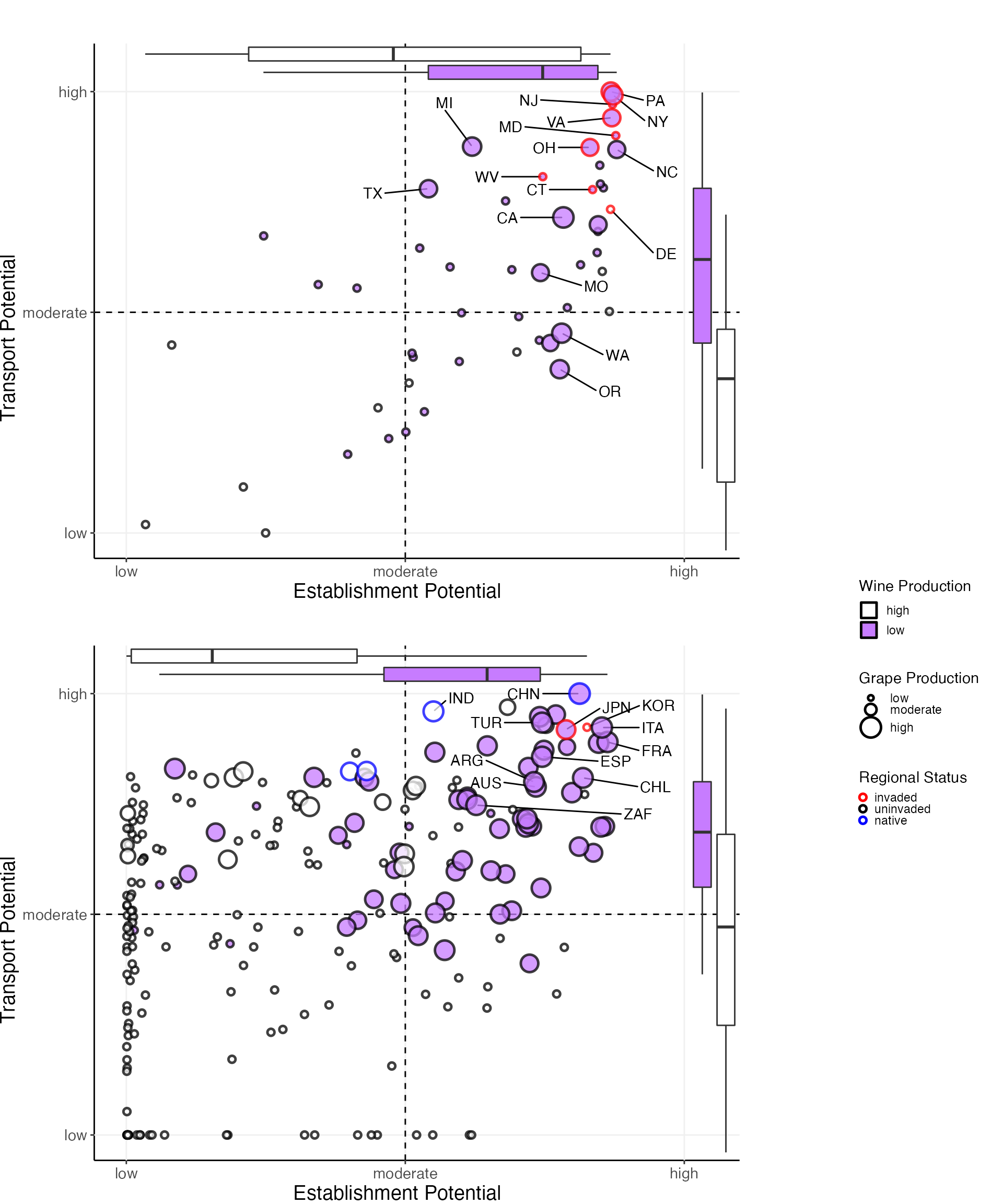
Save plot output
We can also save the static plots to /vignettes as a
.pdf. Note that the saving chunks can be run by setting the
top if from FALSE to TRUE!
if(FALSE){
  #optional save as pdf code
if(present_transport){
    pdf(file.path(here::here(),"vignettes", paste0("combined_present_max_",impact_prod,".pdf")),width = 10, height = 12)

} else{
    pdf(file.path(here::here(),"vignettes", paste0("combined_future_max_",impact_prod,".pdf")),width = 7.5, height = 12)

}
  grid.arrange(states_grob, countries_grob, legend_country, nrow = 7, ncol = 6, layout_matrix = lay1, heights = c(1,1,1, 0, 1,1,1), widths = c(1,1,1,0.1,0.57,0.57))
  invisible(dev.off())
}
We also save a version of the combined plots with the legend as a
separate file to /vignettes.
if(FALSE){
  #save the plots w/o legend
#set up a layout grid
  lay2 <- rbind(c( 1, 1, 1, 1, 1,NA),
               c( 1, 1, 1, 1, 1,NA),
               c( 1, 1, 1, 1, 1,NA),
               c(NA,NA,NA,NA,NA,NA),
               c( 2, 2, 2, 2, 2,NA),
               c( 2, 2, 2, 2, 2,NA),
               c( 2, 2, 2, 2, 2,NA)
  )

if(present_transport){
    pdf(file.path(here::here(),"vignettes", paste0("combined_present_max_",impact_prod,"_nolegend.pdf")),width = 7.5, height = 12)
} else{
    pdf(file.path(here::here(),"vignettes", paste0("combined_future_max_",impact_prod,"_nolegend.pdf")),width = 7.5, height = 12)
}
#finish out the plotting
  grid.arrange(states_grob, countries_grob, nrow = 7, ncol = 6, layout_matrix = lay2, heights = c(1,1,1, 0, 1,1,1), widths = c(0.99,0.99,1,1,1,1))
  invisible(dev.off())


#save the legend
if(present_transport){
  pdf(file.path(here::here(),"vignettes", paste0("legend_combined_present_max_",impact_prod,".pdf")),width = 3, height = 10)
} else{
  pdf(file.path(here::here(),"vignettes", paste0("legend_combined_future_max_",impact_prod,".pdf")),width = 3, height = 10)
}
#finish out the plotting
grid.draw(legend_country)
invisible(dev.off())

}