Invasion Potential Maps
vignette-030-potentials-maps.RmdBuild and Save Maps of Transport and Establishment Potential
This vignette produces the published map figures that demonstrate
where SLF is most likely to become established, the
states and countries that trade most with the present
scenario infected states, and shows locations of important viticultural
areas (areas of high impact potential).
Setup
Here we load the packages required to visualize the maps.
Toggle plotting options
As in vignette-021-quadrant-plots, we have several
parameters that can be modified to visualize different versions of the
figures. Here is where one could change the version of data for the map
figures via the following:
- present_transport: Use
presentorfutureinfected U.S. states?- default is
TRUEforpresent
- default is
- top_to_plot: Set the number of top transport
potential partners to plot arrows for?
- default is
10
- default is
#we need a switch for this map that does the same thing for including the following states: North Carolina
present_transport <- TRUE
# How many countries and states to highlight for labels?
top_to_plot <- 10
To build the map plots, we have several sources of data that we need to read in, namely:
- viticultural area geographic locations
- suitability maps for
U.S. statesand allcountriesfrom the ensemble model - locations to point to trade partners (capital cities of
statesandcountries)
Of note, the actual trade data (transport potential) will be read conditionally in a later chunk below.
Data preparation
Now that we have most of the data loaded, we can go ahead and
conditionally load the transport potential data based
on the state of present_transport. The
transport potential data for states and
countries are then combined with the appropriate trade
partner coordinate data and an approximate center of the
SLF invasion in the U.S. is added as an origin for
depicting trade arrows in the map figures. The states data
are presented first and then the countries thereafter.
States
#need states trade data
#need to read in trade data to shape network in map figure
if(present_transport == TRUE){
  #data("states_summary_present")
  data("states_summary_present_ensemble")
  states_centers <- states_centers %>%
    #remove the invaded states
    filter(!geopol_unit %in% c("Connecticut","Delaware", "Maryland", "New Jersey", "New York", "Ohio", "Pennsylvania", "Virginia", "West Virginia")) %>%
    #remove the others in the dataset
    filter(!is.na(x), !is.na(y)) %>%
    rbind(c("SLF", NA, 40.400189, -75.917622)) %>%
    mutate(x = as.numeric(x), y = as.numeric(y))

#now add the "invaded core" == SLF as a column
states_summary_present <- states_summary_present_ensemble %>%
  cbind("SLF", .) %>%
  as_tibble() %>%
  mutate(origin = `"SLF"`) %>%
  dplyr::select(-`"SLF"`) %>%
  dplyr::select(origin, everything())

#now merge the coords for destinations (ONLY WINE PRODUCING STATES)
states_trade_final <- left_join(states_summary_present, states_centers, by = "geopol_unit") %>%
  filter(!is.na(x), !is.na(y))

#add the coords for SLF as a separate set of cols
states_trade_final <- states_centers %>%
  filter(geopol_unit == "SLF") %>%
  dplyr::select(x,y) %>%
  mutate(xend = x, yend = y) %>%
  dplyr::select(xend, yend) %>%
  cbind(states_trade_final, .) %>%
  as_tibble()

} else {
  #data("states_summary_future")
  data("states_summary_future_ensemble")
    states_centers <- states_centers %>%
    #remove the invaded states
    filter(!geopol_unit %in% c("Connecticut","Delaware", "Maryland", "New Jersey", "New York", "North Carolina", "Ohio", "Pennsylvania", "Virginia", "West Virginia")) %>%
    #remove the others in the dataset
    filter(!is.na(x), !is.na(y)) %>%
    rbind(c("SLF", NA, 40.400189, -75.917622)) %>%
    mutate(x = as.numeric(x), y = as.numeric(y))

        #now add the "invaded core" == SLF as a column
    states_summary_future <- states_summary_future_ensemble %>%
      cbind("SLF", .) %>%
      as_tibble() %>%
      mutate(origin = `"SLF"`) %>%
      dplyr::select(-`"SLF"`) %>%
      dplyr::select(origin, everything())

    #now merge the coords for destinations (ONLY WINE PRODUCING STATES)
    states_trade_final <- left_join(states_summary_future, states_centers, by = "geopol_unit") %>%
      filter(!is.na(x), !is.na(y))

    #add the coords for SLF as a separate set of cols
    states_trade_final <- states_centers %>%
      filter(geopol_unit == "SLF") %>%
      dplyr::select(x,y) %>%
      mutate(xend = x, yend = y) %>%
      dplyr::select(xend, yend) %>%
      cbind(states_trade_final, .) %>%
      as_tibble()

    }
Countries
#edit the world centers to also have the SLF U.S. invasion point
countries_centers <- countries_centers %>%
  #rm the others in the dataset
  filter(!is.na(x), !is.na(y)) %>%
  #add center for SLF invasion in U.S.
  #rbind(c("SLF", NA, -75.917622, 40.400189)) %>%
  rbind(c(rep("SLF", times = 4), -75.917622, 40.400189)) %>%  #(x,y) for coords
  #add the netherlands, not a wine country but needs a set of coords
  #rbind(c("Netherlands", NA, unlist(gCentroid(SpatialPointsDataFrame(map_data('world')[map_data('world')$region %in% "Netherlands",1:2], data = map_data('world')[map_data('world')$region %in% "Netherlands",]))@coords))) %>%
  #same for indonesia
  #rbind(c("Indonesia", NA, unlist(gCentroid(SpatialPointsDataFrame(map_data('world')[map_data('world')$region %in% "Indonesia",1:2], data = map_data('world')[map_data('world')$region %in% "Indonesia",]))@coords))) %>%
  #same for these if going for top 25: Singapore, Taiwan, Saudi Arabia, Vietnam, Venezuela, Gibraltar
  #mutate(x = as.numeric(x), y = as.numeric(y), avg_wine = as.numeric(avg_wine))
  mutate(x = as.numeric(x), y = as.numeric(y))

#now we manually bump Canada's coords up a little bit to make more visible
countries_centers$y[countries_centers$geopol_unit == "Canada"] <- countries_centers$y[countries_centers$geopol_unit == "Canada"] + 5


if(present_transport == TRUE){
  #data("countries_summary_present")
  data("countries_summary_present_ensemble")

  #filter out the countries with SLF
  countries_summary_present <- countries_summary_present_ensemble %>%
  filter(!geopol_unit %in% c("China", "Japan", "Korea, South", "India")) %>%
  cbind("SLF", .) %>%
  as_tibble() %>%
  mutate(origin = `"SLF"`) %>%
  dplyr::select(-`"SLF"`) %>%
  dplyr::select(origin, everything())

  #now merge the coords for destinations (ONLY WINE PRODUCING countries)
countries_trade_final <- left_join(countries_summary_present, countries_centers, by = "geopol_unit") %>%
  filter(!is.na(x), !is.na(y))


} else {
  #data("countries_summary_future")
  data("countries_summary_future_ensemble")

  #filter out the countries with SLF
  countries_summary_future <- countries_summary_future_ensemble %>%
  filter(!geopol_unit %in% c("China", "Japan", "Korea, South", "India")) %>%
  cbind("SLF", .) %>%
  as_tibble() %>%
  mutate(origin = `"SLF"`) %>%
  dplyr::select(-`"SLF"`) %>%
  dplyr::select(origin, everything())

    #now merge the coords for destinations (ONLY WINE PRODUCING countries)
countries_trade_final <- left_join(countries_summary_future, countries_centers) %>%
  filter(!is.na(x), !is.na(y))

}

#add the coords for SLF as a separate set of cols
countries_trade_final <- countries_centers %>%
  filter(geopol_unit == "SLF") %>%
  dplyr::select(x,y) %>%
  mutate(xend = x, yend = y) %>%
  dplyr::select(xend, yend) %>%
  cbind(countries_trade_final, .) %>%
  as_tibble()
Plots
We are now able to plot both the states and
countries published map figures. We stepwise add in the
different features, beginning with the suitability raster and
geopolitical boundary outlines (the latter ships with
ggplot2 in map_data()). We then add red outlines for the U.S. states that have
established SLF according to the scenario selected with
present_transport. Following that, purple points are added for viticultural
areas. Lastly, we add arrows from the approximate center of the
SLF invasion in the U.S. to high
transport potential trade partners.
States
#plot just the states and suitability first
map_plot <- ggplot() +
  geom_raster(data = suitability_usa_df, aes(x = x, y = y, fill = rescale(value)), alpha=0.9, show.legend = T) +
  scale_fill_gradientn(limits= c(0,1), name = "Suitability", colors = rev(c("#e31a1c","#fd8d3c", "#fecc5c", "#FFFFFF"))) +
  geom_polygon(data = map_data('state'), aes(x = long, y = lat, group = group), fill = NA, color = "black", lwd = 0.10) +
  theme_bw() +
  labs(x = "", y = "") +
  theme(panel.grid.major = element_blank(),
        panel.grid.minor = element_blank(),
        panel.background = element_blank()) +
  coord_quickmap(xlim = c(-124.7628, -66.94889), ylim = c(24.52042, 49.3833)) +
  ggtitle(label = "")

#add in lines for the infected states
if(present_transport == TRUE){
  map_plot <- map_plot +
    geom_polygon(data = map_data('state', c("Connecticut","Delaware", "Maryland", "New Jersey", "New York", "Ohio", "Pennsylvania", "Virginia", "West Virginia")), aes(x = long, y = lat, group = group), fill = NA, color = "#e31a1c", lwd = 0.75)
    #geom_polygon(data = map_data('state', c("Connecticut","Delaware", "Indiana", "Maryland", "Massachusetts", "New Jersey", "New York", "Ohio", "Pennsylvania", "Virginia", "West Virginia")), aes(x = long, y = lat, group = group), fill = NA, color = "#000000", lwd = 0.75)

} else{
  map_plot <- map_plot +
    geom_polygon(data = map_data('state', c("Connecticut","Delaware", "Maryland", "New Jersey", "New York", "North Carolina", "Ohio", "Pennsylvania", "Virginia", "West Virginia")), aes(x = long, y = lat, group = group), fill = NA, color = "#e31a1c", lwd = 0.75)
}

#add in the wine AVA data
map_plot <- map_plot +
    geom_point(data = wineries %>% filter(Country == "United States"), aes(x = x, y = y), color = "black", fill = "purple", size = 1.5, shape = 21, alpha = 0.99, show.legend = F)

#add in the trade
map_plot <- map_plot +
    geom_curve(aes(x = x, y = y, xend = xend, yend = yend), data = states_trade_final %>%  arrange(desc(avg_infected_mass)) %>% .[1:top_to_plot,], size = 1, curvature = 0.33, alpha = 0.8, show.legend = T, color = "#778899",
               arrow = arrow(ends = "first", length = unit(0.01, "npc"), type = "closed"))

#show it
map_plot
#> Warning: Raster pixels are placed at uneven horizontal intervals and will be
#> shifted. Consider using geom_tile() instead.
#> Warning: Raster pixels are placed at uneven vertical intervals and will be
#> shifted. Consider using geom_tile() instead.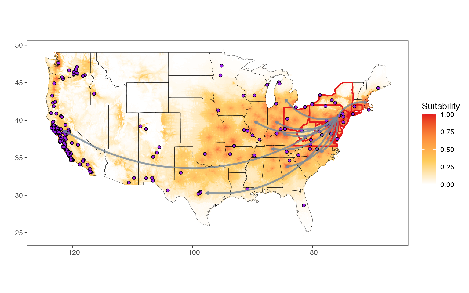
Countries
#plot just the countries and suitability first
map_plot_countries <- ggplot() +
  geom_raster(data = suitability_countries_df, aes(x = x, y = y, fill = rescale(value)), alpha=0.9, show.legend = T) +
  scale_fill_gradientn(limits= c(0,1), name = "Suitability", colors = rev(c("#e31a1c","#fd8d3c", "#fecc5c", "#FFFFFF"))) +
  geom_polygon(data = map_data('world'), aes(x = long, y = lat, group = group), fill = NA, color = "black", lwd = 0.15) +
  theme_bw() +
  labs(x = "", y = "") +
  theme(panel.grid.major = element_blank(),
        panel.grid.minor = element_blank(),
        panel.background = element_blank()) +
  coord_quickmap(xlim = c(-164.5, 163.5), ylim = c(-55,85)) +
  ggtitle(label = "")

#add in lines for the infected states
if(present_transport == TRUE){
  map_plot_countries <- map_plot_countries +
    geom_polygon(data = map_data('state', c("Connecticut","Delaware", "Maryland", "New Jersey", "New York", "Ohio", "Pennsylvania", "Virginia", "West Virginia")), aes(x = long, y = lat, group = group), fill = NA, color = "red", lwd = 0.5)
} else{
  map_plot_countries <- map_plot_countries +
    geom_polygon(data = map_data('state', c("Connecticut","Delaware", "Maryland", "New Jersey", "New York", "North Carolina", "Ohio", "Pennsylvania", "Virginia", "West Virginia")), aes(x = long, y = lat, group = group), fill = NA, color = "#e31a1c", lwd = 0.75)
}


#add in the wine AVA data (global equivalent)
map_plot_countries <- map_plot_countries +
  geom_point(data = wineries, aes(x = x, y = y), color = "black", fill = "purple", size = 0.5, shape = 21, alpha = 0.99, stroke = 0.2, show.legend = F)

#add in the trade
map_plot_countries <- map_plot_countries +
  geom_curve(aes(x = x, y = y, xend = xend, yend = yend), data = countries_trade_final %>%  arrange(desc(avg_infected_mass)) %>% .[1:top_to_plot,], size = 0.45, curvature = 0.33, alpha = 0.8, show.legend = T, color = "#778899", arrow = arrow(ends = "first", length = unit(0.01, "npc"), type = "closed"))

#print it
map_plot_countries 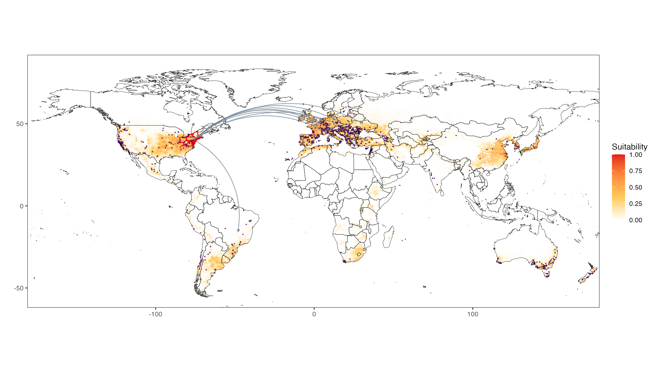
Save plot output
Lastly, we can save the output of our map figure plots as
.pdf files to /vignettes. Note that this chunk
does not run by default but can be run by setting the top
if from FALSE to TRUE!
if(FALSE){
  if(present_transport){
#states
  ggsave(plot = map_plot, filename = file.path(here::here(),"vignettes", paste0("states_map_present.pdf")), width = 7.5, height = 6.5, dpi = 300)
#countries
  ggsave(plot = map_plot_countries, filename = file.path(here::here(),"vignettes", paste0("countries_map_present.pdf")), width = 7.5, height = 6.5, dpi = 300)
} else{
  #states
  ggsave(plot = map_plot, filename = file.path(here::here(),"vignettes", paste0("states_map_future.pdf")), width = 7.5, height = 6.5, dpi = 300)
#countries
  ggsave(plot = map_plot_countries, filename = file.path(here::here(),"vignettes", paste0("countries_map_future.pdf")), width = 7.5, height = 6.5, dpi = 300)
}

}