SLF Spread Through Time
vignette-060-spread-figure.RmdMap of SLF Spread Through Time in the U.S.
We read in the packages to access data and generate the spread map. We also set the option to not download counties shapefiles every time (only the first).
Read in SLF reporting data
The data used here for the spread figure are based on an upcoming
suite of packages (lycodata and lycormap)
produced by the iEcoLab. The records in these packages contain data that
are not yet available to the public, so all questions regarding the raw
data should be directed to the creator of the lycor* suite,
Seba De Bona (SDB, (sebastiano.debona@temple.edu))
or to Matthew R. Helmus (mrhelmus@temple.edu).
Here, we will read in a .rda file that was created using
the example code in the Trade Relationship
(vignette-042-trade-presence) vignette from the raw
data.
#data call
data(by_county, package = "slfrsk")
Plot spread figure
The data are read in above, and the year columns are also transformed into factors for easier plotting.
# transforming records and establishment
by_county %<>%
  mutate(YearOfEstablishment = as.factor(YearOfEstablishment),
         FirstRecord = as.factor(FirstRecord))
Lastly, we plot the data after identifying a set of focal counties to
outline (this bypasses layering issues with sf objects and
plotting with ggplot2).
#get the focal counties to outline
focal_counties <- by_county %>%
  filter(!is.na(FirstRecord)) %>%
  as.data.frame(.) %>%
  dplyr::select(GEOID) %>%
  unlist()

map_plot <- ggplot() +
  #geom_sf(data = by_county %>% filter(!GEOID %in% focal_counties), fill = "#FFFFFF", size = 0.5) +
    geom_polygon(data = map_data('state'), aes(x = long, y = lat, group = group), fill = "#FFFFFF", color = "black", lwd = 0.10) +
  geom_polygon(data = map_data('state', c("Connecticut","Delaware", "Maryland", "New Jersey", "New York", "Ohio", "Pennsylvania", "Virginia", "West Virginia")), aes(x = long, y = lat, group = group), fill = NA, color = "#e31a1c", lwd = 0.75) +
  geom_sf(data = by_county %>% filter(GEOID %in% focal_counties), aes(color = FirstRecord, fill = YearOfEstablishment), show.legend = T) +
  coord_sf(xlim = c(-124.7628, -66.94889), ylim = c(24.52042, 49.3833), expand = FALSE) +
  labs(x = "", y = "") +
  theme_bw() +
  theme(panel.grid.major = element_blank(),
        panel.grid.minor = element_blank(),
        panel.background = element_rect(fill = "aliceblue")) +
  scale_color_brewer(palette = "YlOrRd", direction = 1, name = "Regulatory Incident", guide = guide_legend(override.aes = list(fill = "#808080"))) +
  scale_fill_brewer(palette = "YlOrRd", direction = 1, name = "Establishment", na.value = "#808080", breaks = c(2014,2015,2016,2017,2018,2019,2020)) +
  ggtitle(label = "")

map_plot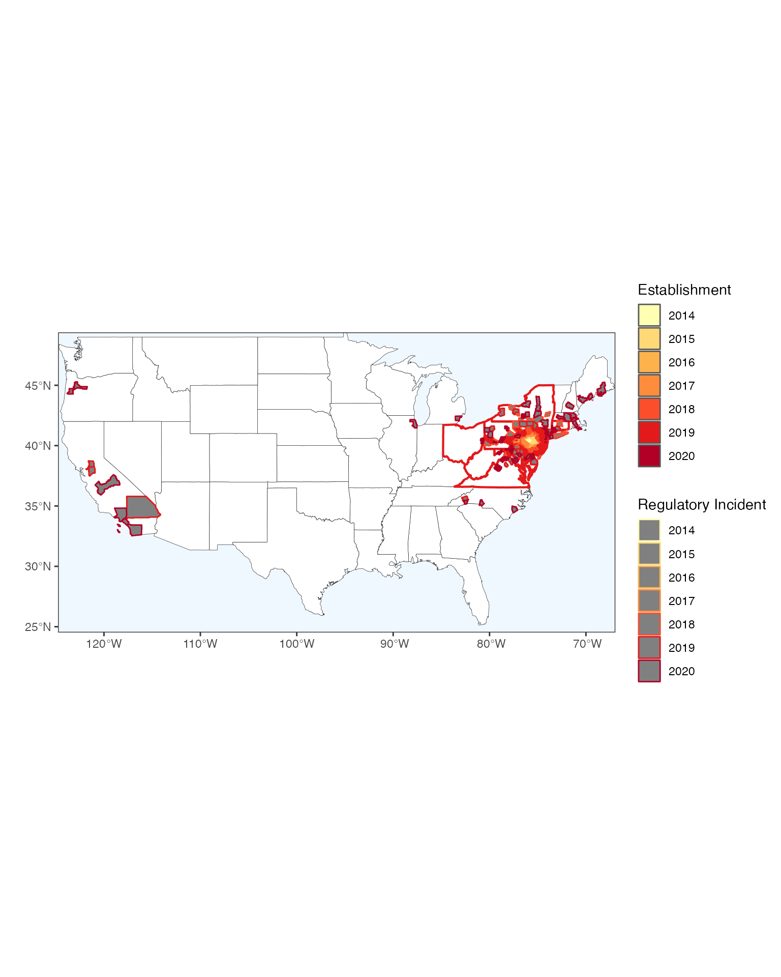
Extras
We also include a modification of SDB code here to show how to make a
nice leaflet interactive map too… but we do not use this
code.
library(leaflet)

colpal <- colorFactor(c(brewer.pal(7, "YlOrRd")),
                   by_county$YearOfEstablishment,
                   na.color = "transparent")
fillpal <- colorFactor(c(brewer.pal(7, "YlOrRd")),
                   by_county$FirstRecord,
                   na.color = "transparent")

leaflet(data = by_county,
        options = leafletOptions(minZoom = 4, maxZoom = 18)) %>%
  addProviderTiles(providers$CartoDB.Positron) %>%
  addPolygons(label = ~NAME,
              color = ~colpal(FirstRecord),
              weight = 2,
              smoothFactor = 0.5,
              opacity = 0.5,
              fillOpacity = 0.5,
              fillColor = ~fillpal(YearOfEstablishment)) %>%
  setView(lat = 40.80, lng = -100, zoom = 4) %>%
  addLegend("bottomleft", pal = fillpal,
    title = "Invaded since",
    values = ~YearOfEstablishment,
    opacity = 1
  )